
Utah state flag redesign
Evolution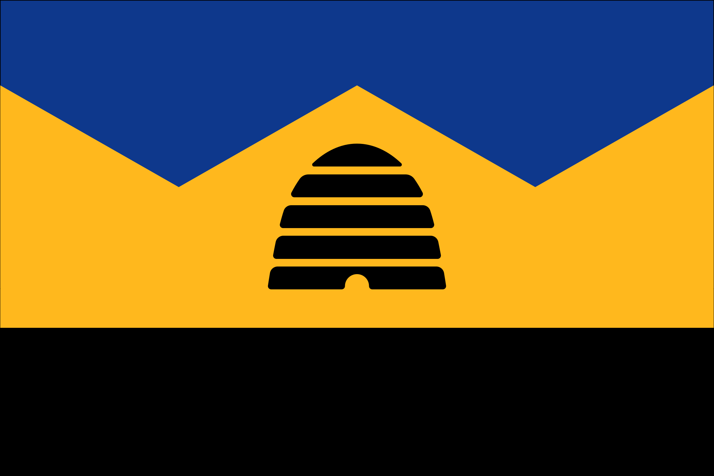
Current Utah flag
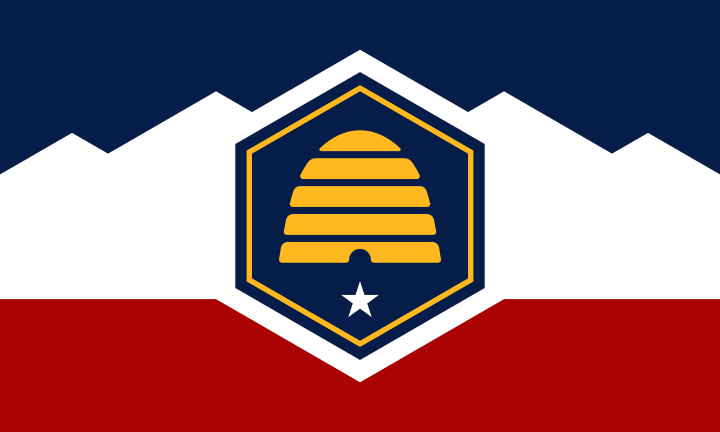
Utah did away with the seal-on-a-bedsheet design. Their new design, while streets ahead of its predecessor, still feels a bit corporate and designed by committee. It also relies on generic "Red, White, and Blue".
Design and symbolism
My redesign makes it more distinctly Utah. I’ve ditched the red, white, and blue in favor of a palette of blue, black, and yellow. By removing the hexagon and simplifying the mountains, I’ve created a more organic design that feels more Utah.
Mountain landscape
Even in simplified form, the mountain landscape remains immediately recognizable as Utah.
The Beehive
The honey bee and beehive have long associated with Utah. The beehive doesn't need a hexagon or star, it alone becomes the distinct and central element of the design.
Unique colors
Changing from generic red, white and blue to a unique palette of blue, yellow, and black gives the state a distinctive design framework. The black and yellow represent the bee and, combined with the blue, create a visually pleasing and distinct scheme.


I acknowledge the Traditional Owners of the lands throughout Australia on which these federal divisions are drawn and pay my respects to their Elders, past and present.